Gallery
Where project media, prompt-driven generations, and generated groups collect.
Gallery overview
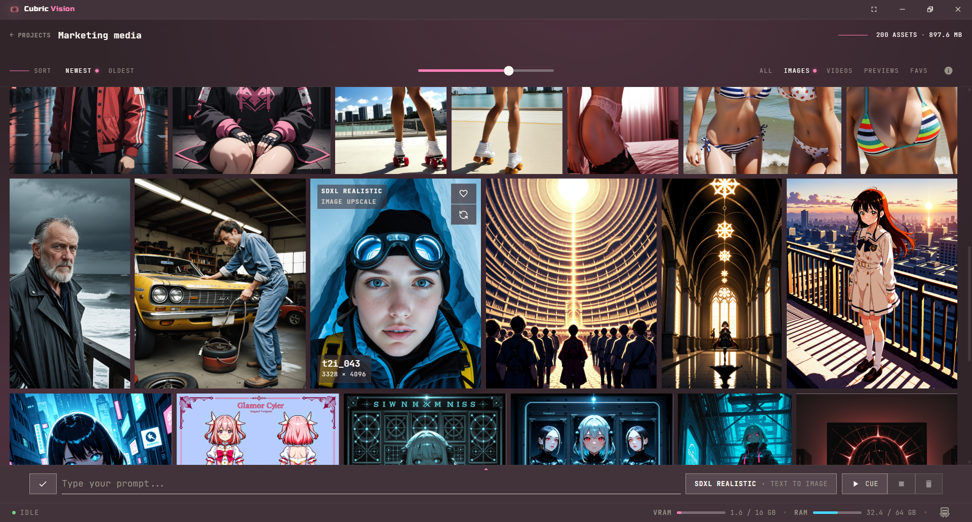
The Gallery is the default workspace after you open a project. It shows generated groups and imported media as visual cards, with sorting, filtering, thumbnail sizing, and the Prompt Box available from the same screen.
Browse project media
Use Newest and Oldest to change the order of the gallery. Use All, Images, Videos, Previews, and Favs to narrow the grid to the kind of media you want to inspect.
Open a card when you want to inspect its history or continue refining it. The Gallery stays focused on choosing media; detailed image and video work happens after you open a generated group.
Gallery layout controls
The centered size slider above the gallery lets you change thumbnail sizes in-place, before the grid itself.
- Drag the slider to make cards smaller or larger.
- Press + or - to move between four gallery size steps.
- Use Ctrl/Cmd + + or Ctrl/Cmd + - for full interface zoom (UI scaling) when you want everything in the app to grow or shrink.
Selection mode
Use selection mode to batch-select cards without opening each one.
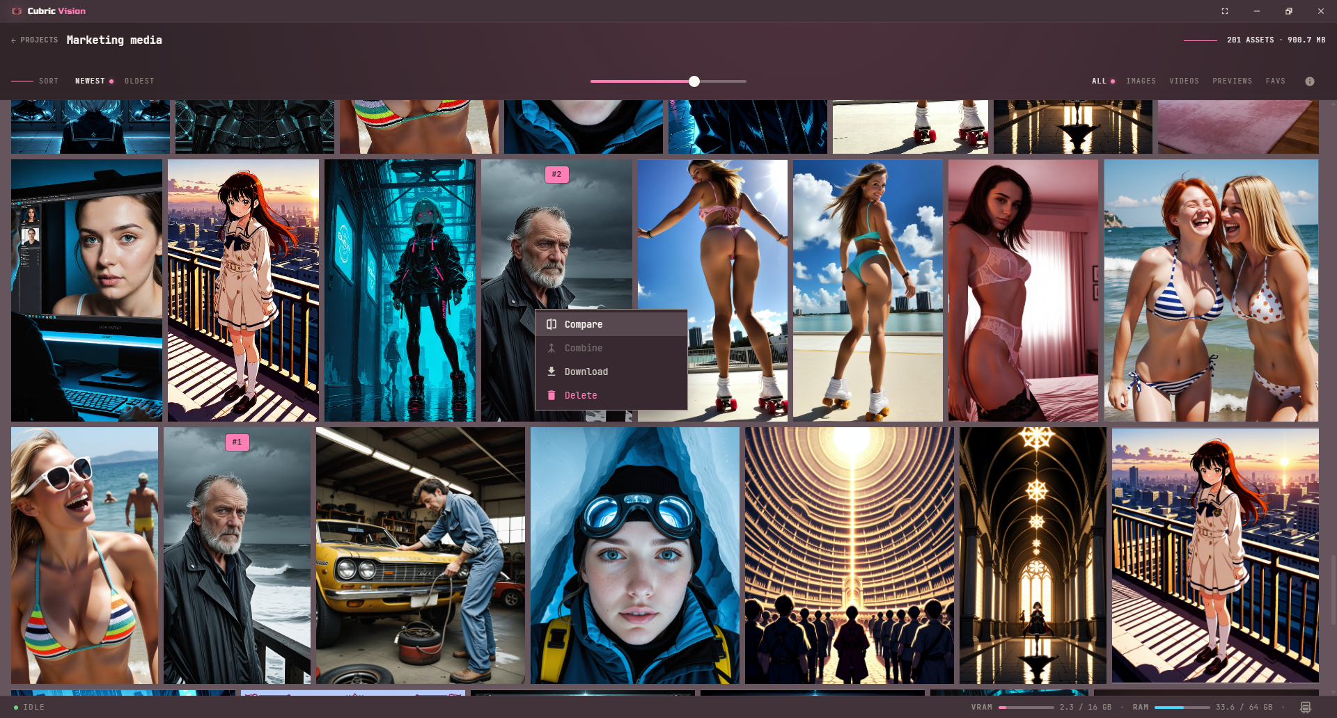
- Hold Ctrl (or Cmd on Mac) and click a card. This enters selection mode, hides the Prompt Box, and marks that card as #1.
- While in selection mode, each additional click toggles a card’s selected state. A selected card can be deselected with another click.
- Shift-click works like file-browser range selection: cards between the anchor and clicked card are selected.
- Outside selection mode, a plain click opens history. In selection mode, plain clicks never open history.
- Press Escape to clear all selections and return to normal browsing.
Selection context menu
Right-click a card, or use the context-menu key, for actions on the current selection.
- Compare is only active when exactly two items are selected.
- Combine is only active when all selected items are videos and at least two are selected. Combine order uses selection order.
- Download saves the selected cards.
- Delete removes selected cards and all associated history entries.
Compare gallery items
Compare supports image + image, image + video, and video + video. Use it to quickly inspect differences or continuity between two selected items.
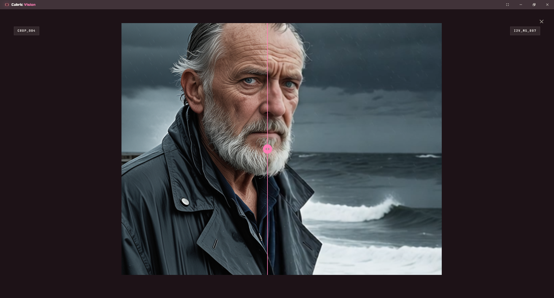
Card information mode
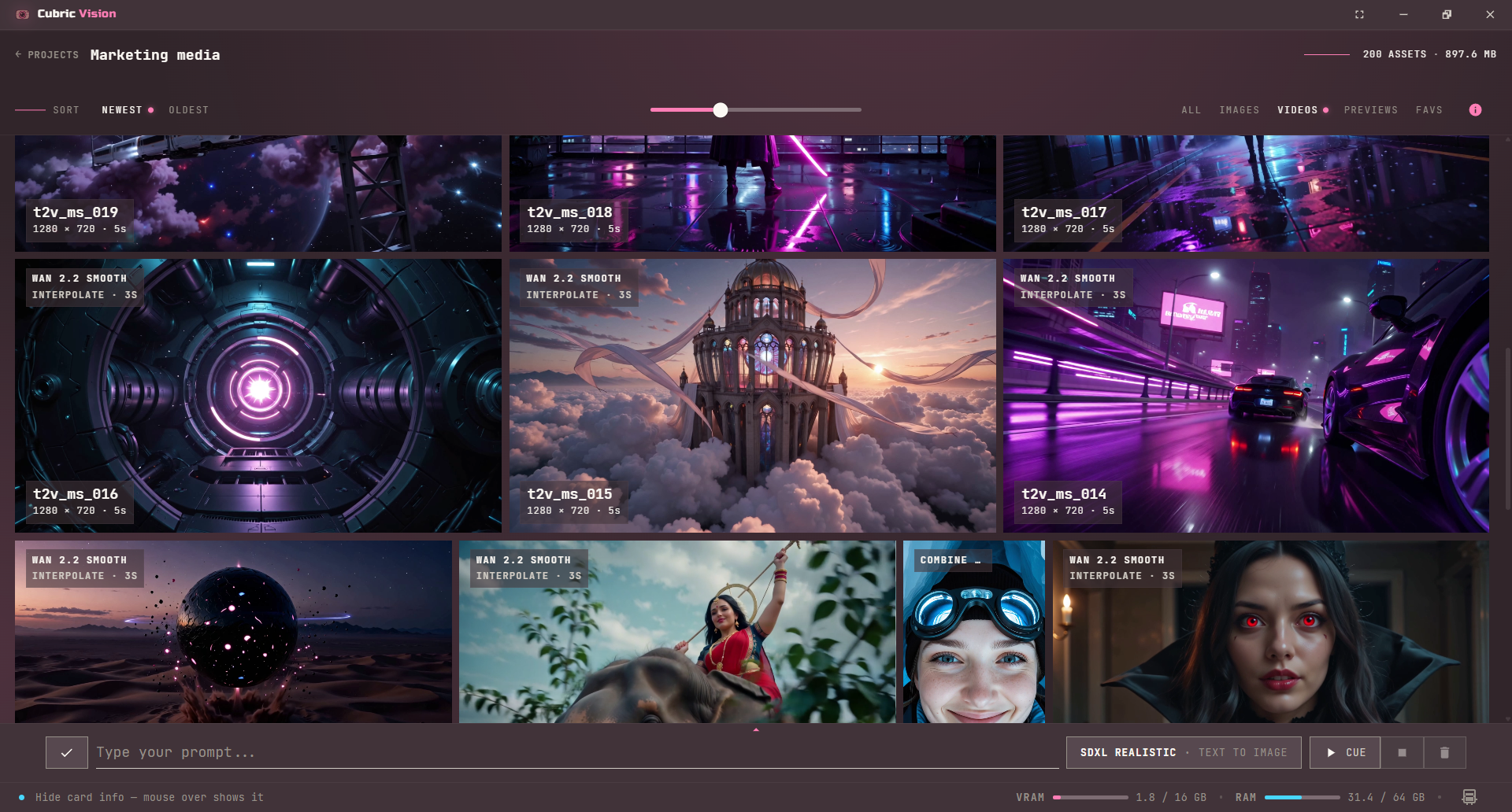
Use the Info button in the Gallery toolbar to invert how card labels appear. With the mode off, card information appears when you hover a card. With the mode on, each card shows its model, operation, name, dimensions, and duration by default.
Hovering a card while information mode is on temporarily clears its labels, so you can inspect the image or video frame without the metadata covering the visual.
Focus mode
Press F to toggle focus mode when you want the Gallery to use more of the screen for media. Focus mode hides the surrounding app chrome while keeping the current workspace active.
Press Esc to leave focus mode. Escape uses the same overlay behavior as pop-ups and other temporary app surfaces.