Gallery
Where project media, prompt-driven generations, and generated groups collect.
Gallery overview
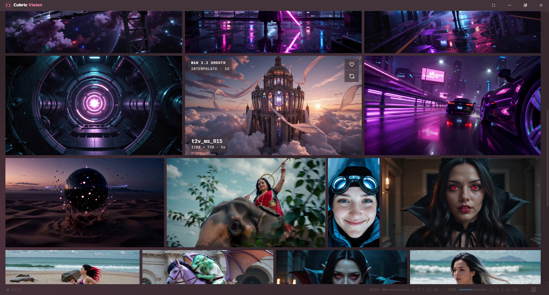
The Gallery is the default workspace after you open a project. It shows generated groups and imported media as visual cards, with sorting, filtering, thumbnail sizing, and the Prompt Box available from the same screen.
Flows
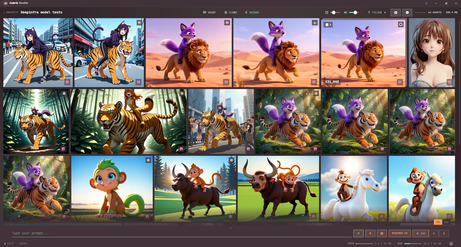
Press Flows, the button centred at the top of the gallery, to open the Flow Library. It sits between Agent and Record, and it is the fastest way to reach a flow from wherever you are working.
Browse project media
Open a card when you want to inspect its history or continue refining it. The Gallery stays focused on choosing media; detailed image and video work happens after you open a generated group.
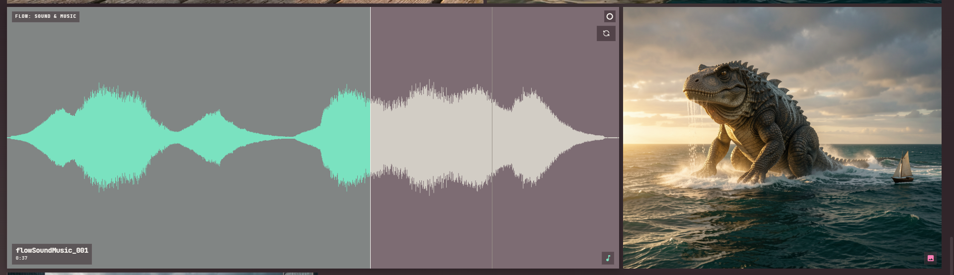
Every kind of project media shows in the same grid: images, GIFs, videos, and audio. An audio card draws as a wide tile filled with its own waveform instead of a thumbnail. Hovering a video or audio card plays its sound, one card at a time, at whatever the volume slider above the grid is set to; playback stops the moment you scroll. Click anywhere on an audio card's waveform to jump the playhead there.
Drag a card out to another app to export it, or into the Prompt Box to use it as an input.
Importing media
Drop a file onto the Gallery and a card with a spinner appears the moment the drop lands, then turns into the finished card once the import completes.
Very large photos are welcome: images up to 16K import, thumbnail, and open for editing. Anything bigger than 4K prompts you once per drop to shrink it to a size (1 to 5 megapixels, or keep the original) most tools in Cubric Studio handle quickly; your original file on disk is never changed. SVG files import as pictures, not vector art.
Filter, archive, and info
Above the grid, past the size and volume sliders, sit three more buttons: FILTER, ARCHIVE, and INFO.
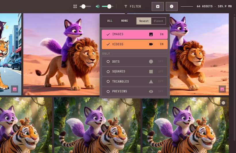
Click FILTER to open its panel. It lists every media kind your project actually has cards of (Images, GIFs, Videos, Audio), each as a row you switch on or off; All clears every filter and None hides everything currently listed. Below the kinds, an Only section filters by the shape mark on a card, and a Previews switch shows only cards still mid-generation. Newest and Oldest, previously their own buttons above the grid, now sit at the top of this same panel. FILTER shows a highlighted dot whenever something is hidden, so a short-looking grid never reads as missing media.
ARCHIVE swaps the grid to show cards you have archived instead of your active ones; nothing is deleted, and an archived card keeps its files. Right-click an archived card and choose Return to gallery to bring it back. See Card context menu for how a card gets archived in the first place.
INFO is covered in Card information mode below.
Gallery layout controls
The centered size slider above the gallery lets you change thumbnail sizes in-place, before the grid itself.
- Drag the slider to make cards smaller or larger.
- Press + or - to move between four gallery size steps.
- Use Ctrl/Cmd + + or Ctrl/Cmd + - for full interface zoom (UI scaling) when you want everything in the app to grow or shrink.
Your gallery layout is remembered: the card-size slider and card information mode persist across restarts.
Hover volume
A second slider sits beside the size slider and sets how loud a hovered video or audio card plays. Drag it, or point at it and use the mouse wheel; the speaker icon beside it switches to a muted speaker at zero. The level is remembered between sessions.
Zero is the mute. An audio card at zero stays silent rather than pretending to play, and a video still previews, just without sound. This slider replaced the Play audio on hover switch that used to sit in Settings — same control, now in the room where you use it.
Card marks
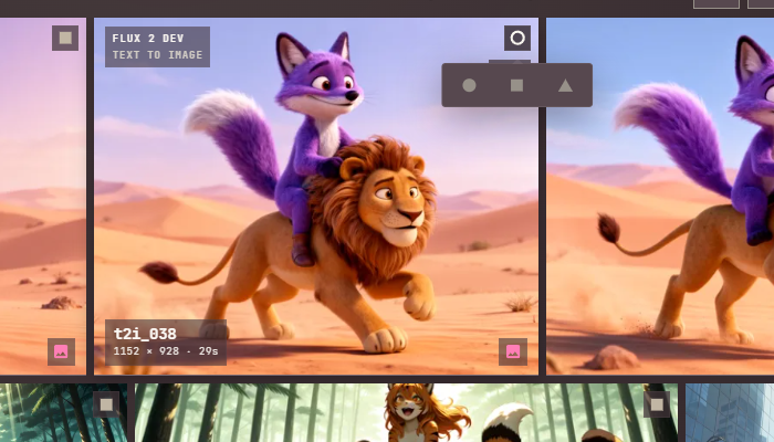
Every card has a small mark button in its top-right corner, where the heart used to sit. Click it to toggle a dot on or off. Hold it down and a small menu opens under it with all three shapes; release over one to pick it, or let go and click one, and it replaces whatever mark the card had.
Use marks to tag cards any way you like, best pick, needs a redo, whatever a dot, a square, or a triangle means to you. Open FILTER and turn on the shapes you want under Only to show just the cards carrying them.
Selection mode
Use selection mode to batch-select cards without opening each one.
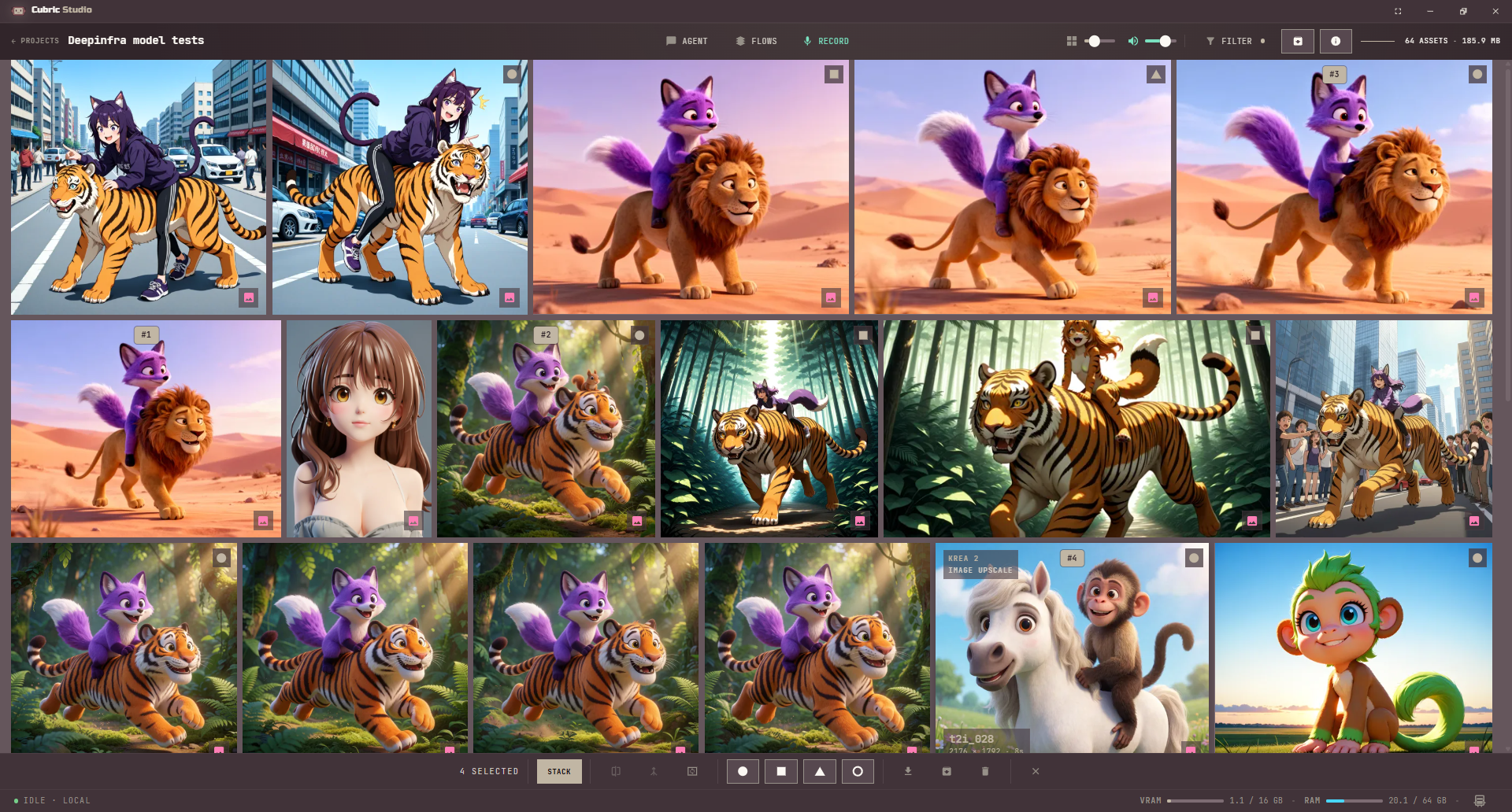
- Hold Ctrl (or Cmd on Mac) and click a card. This enters selection mode, hides the Prompt Box in favor of the selection bar, and marks that card as #1.
- While in selection mode, each additional click toggles a card’s selected state. A selected card can be deselected with another click.
- Shift-click works like file-browser range selection: cards between the anchor and clicked card are selected.
- Outside selection mode, a plain click opens history. In selection mode, plain clicks never open history.
- Right-clicking a card that is not part of the current selection acts on that card alone, and leaves the selection as it was.
- Press Escape to clear all selections and return to normal browsing.
Selection bar
Selecting one or more cards hides the Prompt Box and puts the selection bar in its place. From left to right it holds: how many cards are selected, Stack and Routines, then Compare, Combine, and Make GIF, then a button for each mark shape plus one to clear marks, then Download, Archive, and Delete, and finally a close button. Point at any icon-only button to see what it does, or why it is greyed out, in the status bar. Click the close button or press Esc to close the bar and leave selection mode.
- Stack collects two or more selected cards, all images or all videos, into one stacked card, in the order you clicked them. See Stacks.
- Routines runs a routine the agent saved on the selected cards. It only appears once you have saved one. See Routines.
- Compare needs exactly two selected cards (not a stack). See Compare gallery items.
- Combine needs two or more selected video cards, and joins them into one clip in click order.
- Make GIF needs two or more selected still images (no video, audio, or GIF cards), and turns them into a GIF in click order. See GIFs.
- The mark buttons apply one shape (or clear it) to every selected card at once. See Card marks.
- Download, Archive, and Delete act on the whole selection the same way they do from the card context menu.
Stacks
A stack collects several cards into one, so you can run the same operation over all of them at once. Select two or more cards of the same kind, all images or all videos, and press Stack on the selection bar.
Drop a stack onto the Prompt Box to run the current operation over every card inside it. The results come back as a new stack, queued as a single row you can cancel all at once.
Open a stack and History shows its cards as a strip under the Prompt Box. Right-click one for Remove from stack, which puts that card back in the gallery, or Delete card, which asks first and then deletes the card and every version inside it. Deleting the stack card itself from the Gallery asks whether to Unstack, Delete all, or Cancel.
Card context menu
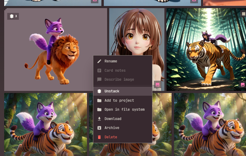
Right-click a card, or use the context-menu key, for actions on the current selection. The menu is split into two groups: this card's own details at the top, then everything that touches its files below. Point at any entry to see what it does in the status bar, including why a greyed-out one is unavailable. Stack, Compare, Combine, and Make GIF are not here; they act on a selection and live on the selection bar only.
- Rename and Card notes label or annotate a card, one at a time. Renames stick across reloads. See Card notes. A card you have not renamed carries an automatic name from the operation that made it, like
edit_004,upscale_002, ori2v_007. - Describe image writes a text description of the card (needs the Image Describer plugin). It reads one still image at a time, never a video or a stack.
- Unstack, on a stack card, puts its cards back in the gallery, each at its own date. Nothing is deleted.
- Add to project copies the selected cards into another project, keeping the names you gave them.
- Open in file system reveals the media file in your file browser.
- Download saves the selected cards.
- Archive puts the selected cards away without deleting anything; the files stay and Reuse Prompt keeps working. See Filter, archive, and info for where archived cards go and how to bring one back.
- Delete always opens a confirmation first: choose Delete to permanently remove the selected cards and their media files, Archive to put them away instead, or Cancel. Once a card is deleted, Reuse Prompt can no longer bring back any input it used; archive a card instead of deleting it to keep Reuse working.

Card notes
A card with notes shows a small notes icon in its top-right corner, between the mark and the reuse button. It stays visible without hovering, so you can scan a project for the cards someone wrote about instead of opening each one. Click the icon to open the notes.
Card notes and Project notes open the same notes window, and both are markdown: headings, lists, tables, and the rest come out formatted. The pencil and eye at the top right switch between editing the text and reading it, and the preview shows what you have typed before you save. The window opens ready to read when there are notes, and ready to type when there are none. Long notes scroll.
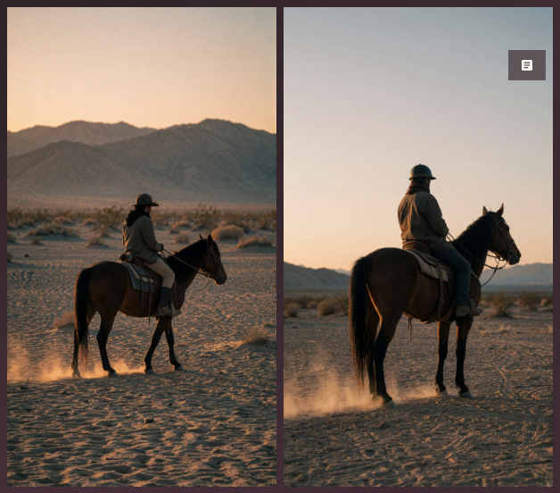
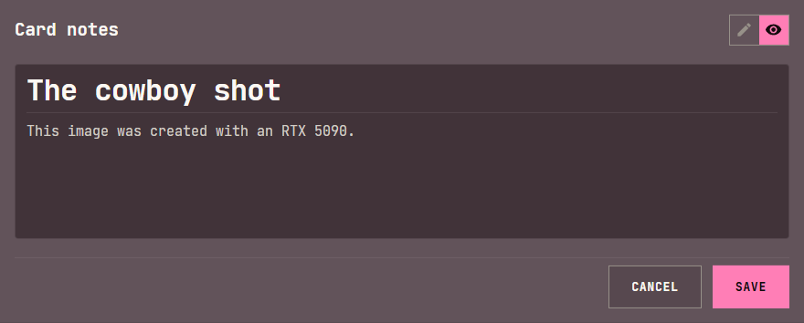
# The cowboy shot reads as a heading. The pencil switches back to editing.Drag a card out of Cubric Studio
Dragging a card into a folder has always worked. Dropping it into Discord, Photoshop, or a browser upload box did nothing, because a plain drag only hands over a promise of a file — something file managers understand and other apps ignore.
Hold Alt while you drag and the card leaves as a real file, so any app that accepts a dropped file takes it. You can let go of Alt once the drag is moving.
If several cards are selected, Alt-dragging one of them drags all of them at once. A card that has no file on disk yet — a preview still generating — cannot be dragged this way.
A plain drag is unchanged: onto the Prompt Box to reuse a card, into a folder to save it.
Compare gallery items
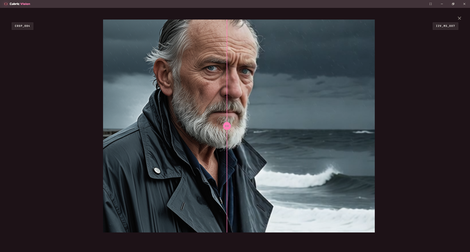
Compare supports image + image, image + video, and video + video. Select exactly two cards and press Compare on the selection bar to quickly inspect differences or continuity between them.
Card information mode
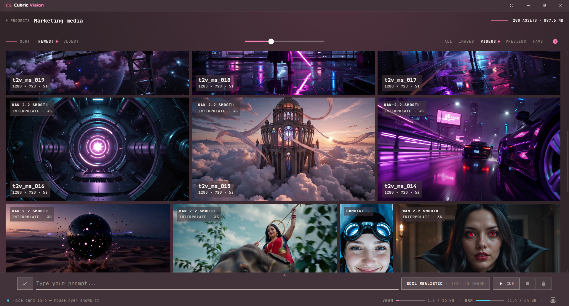
Use the INFO button in the Gallery toolbar to invert how card labels appear. With the mode off, card information appears when you hover a card. With the mode on, each card shows its model, operation, name, dimensions, and duration by default.
Hovering a card while information mode is on temporarily clears its labels, so you can inspect the image or video frame without the metadata covering the visual.
Focus mode
Press F to toggle focus mode when you want the Gallery to use more of the screen for media. Focus mode hides the surrounding app chrome while keeping the current workspace active.
Press Esc to leave focus mode. Escape uses the same overlay behavior as pop-ups and other temporary app surfaces.